This is the story of a tree house and a happy marriage.

A husband and wife, both avid art collectors, hired us to design a new home for them in the hills of Montecito. The wife, an eighth generation Californian, was a dancer who later became a painter. Her current work focuses on color and abstraction. The husband was raised in a small farming town in Ohio. A precocious child, he was gifted at making things, music, and mathematics. These interests led him to Harvard and then to founding a successful manufacturing company. He was also captivated by academia and was instrumental in launching UCLA’s business school.
Together they raised two children. Their children and their mutual passion for the arts were cornerstones of their relationship. They were energetic supporters, avid collectors and committed patrons of a number of arts organizations within greater Los Angeles. They planned yearly trips to visit Art fairs and international exhibitions. As art collectors, she gravitated towards art that focused on color and form. He was more interested in art with political content. They were involved in the founding of MOCA, the Pasadena Museum of California Art, and Kidspace Museum.
In Los Angeles, the couple lived in a 1920 Spanish-style home in Pasadena. For their new home in Montecito they wanted an architect to design them a home that would respond to their interest in contemporary art and design.
The property they chose was a one acre-lot with an existing single-story ranch house; part of a subdivision from the 1960’s. Before the land in Montecito was subdivided, oak trees covered the entire region. The subdivision, rather modest by Montecito standards, was established before there was interest in protecting native landscapes. Back then developers typically clear-cut the native vegetation and graded flat pads for the houses. An expedient and economical solution. This lot, to our surprise, still had a large number of native Coastal Live Oaks. The ranch house, on the other hand, was typical of the period. It had a front yard dedicated to the automobile and the lawn, and a back yard disconnected from the house. Standard tropes of American suburbia.
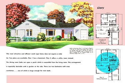
Magazine advertising like this one played a major role in popularizing the ranch house and its "California way of life.”
During our first meeting, they asked if it might be possible to transform the existing ranch house into a “tree house.” Our sense was that the ranch house was located in the wrong place on the lot. The house would never feel connected to the oak trees or be remotely like a tree house. The scale of their artwork was also at odds with the existing house. Our suggestion was that they should build a new house that embraced the trees. Since oak trees are protected, we would never be able to build a conventional house within the drip line. But if we floated the house above the ground it would be possible to build under the oaks. This would get them their tree house. After weighing their options, they agreed to tear down the existing house.
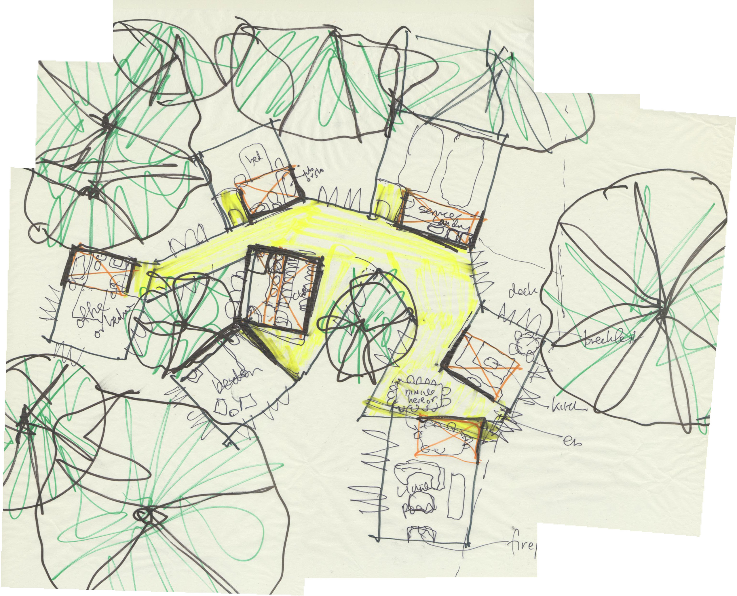
Early sketch by Peter Tolkin of the Branch House.
Together we designed a house to sit within a park-like setting of native shrubs and oaks. At the perimeter of the site a fence and hedge serves as a kind-of picture frame for both the house and oak grove. This would not be the native landscape of the Chumash, nor the cultivated landscape of the colonies, instead it would be an adapted landscape that looked forward and back. Part of the site would be restored, adding new oak trees and a garden of native plants. Where possible the earth would be returned to its natural grade and the topsoil repaired. But we also understood the impossibility of returning the land to its “original” state, and we did not want to recreate a mythic condition.
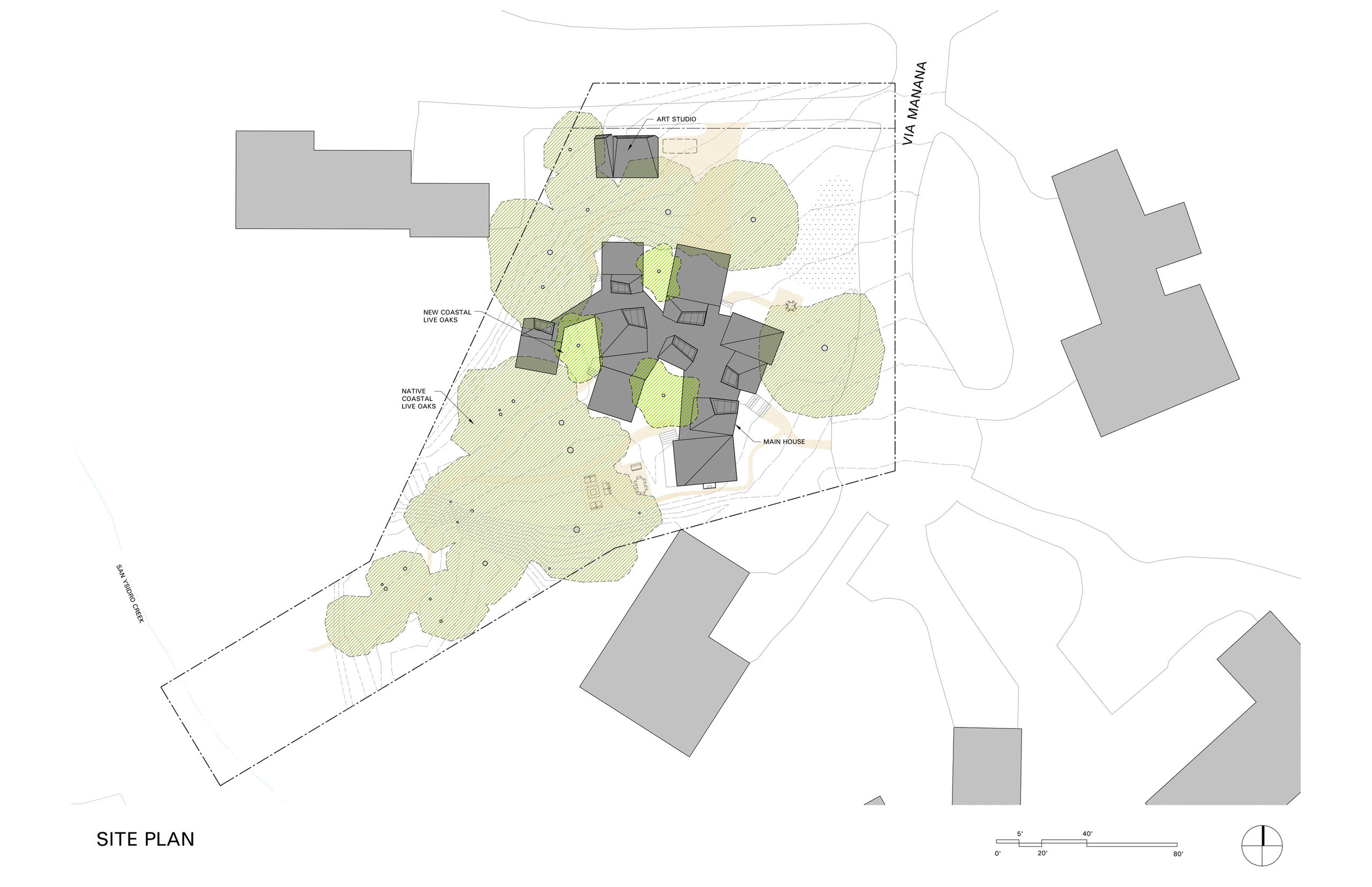
Arranged in the round, on a single horizontal plane, the Branch House was conceived as a cluster of program volumes each with its own unique orientation to light and view. Working closely with an arborist, the volumes were oriented and situated between the existing oak trees. Where the building volumes came into close proximity to the oak root zone we floated the house off the ground by means of concrete piles. An interstitial connecting-spine lined with glass was designed as the home’s main circulation spine and as a gallery to display art. In addition to providing a primary view out to the landscape, each volume was also provided with skylights to offer a secondary natural light source and a view of the sky.
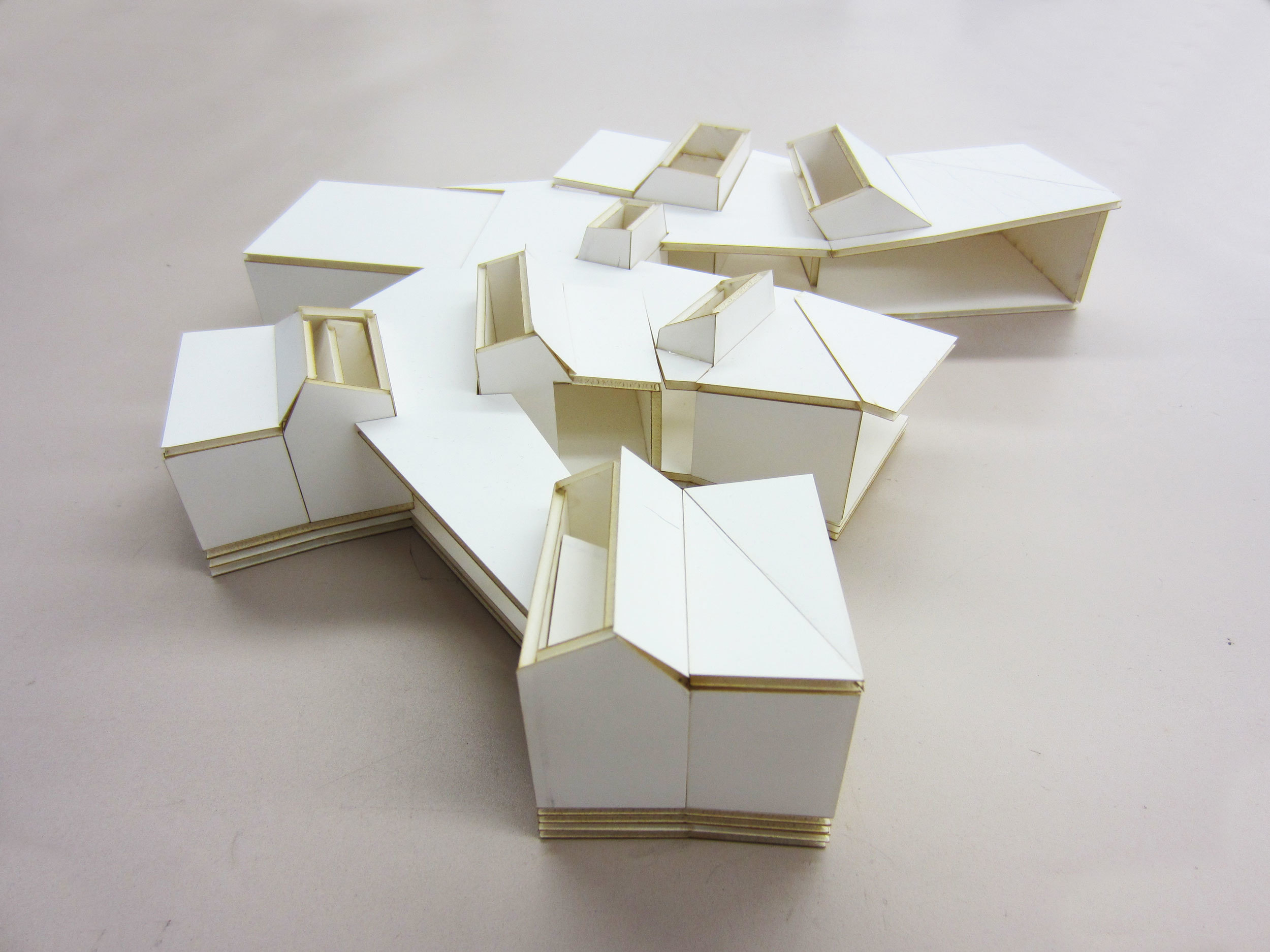
The main structure of Branch House is an exposed post and beam structure adjusted to the geometry of the house and comprised of engineered Laminated Veneer Lumber. This area of Southern California is known for its wildfires. In 2008, the Tea Fire destroyed 210 homes in the surrounding community. As a result, local building codes now prohibit the use of non-fire treated wood as an exterior cladding material. To address these code concerns (and the clients’ desire to live among the trees) the house was built with a wood interior structure and a fire-resistive exterior “armor” made of copper tiles. The copper skin was separated from the wood frame with a rain screen. The size and configuration of the copper tiling was tightly tailored to accommodate the segmented geometry of the room volumes.
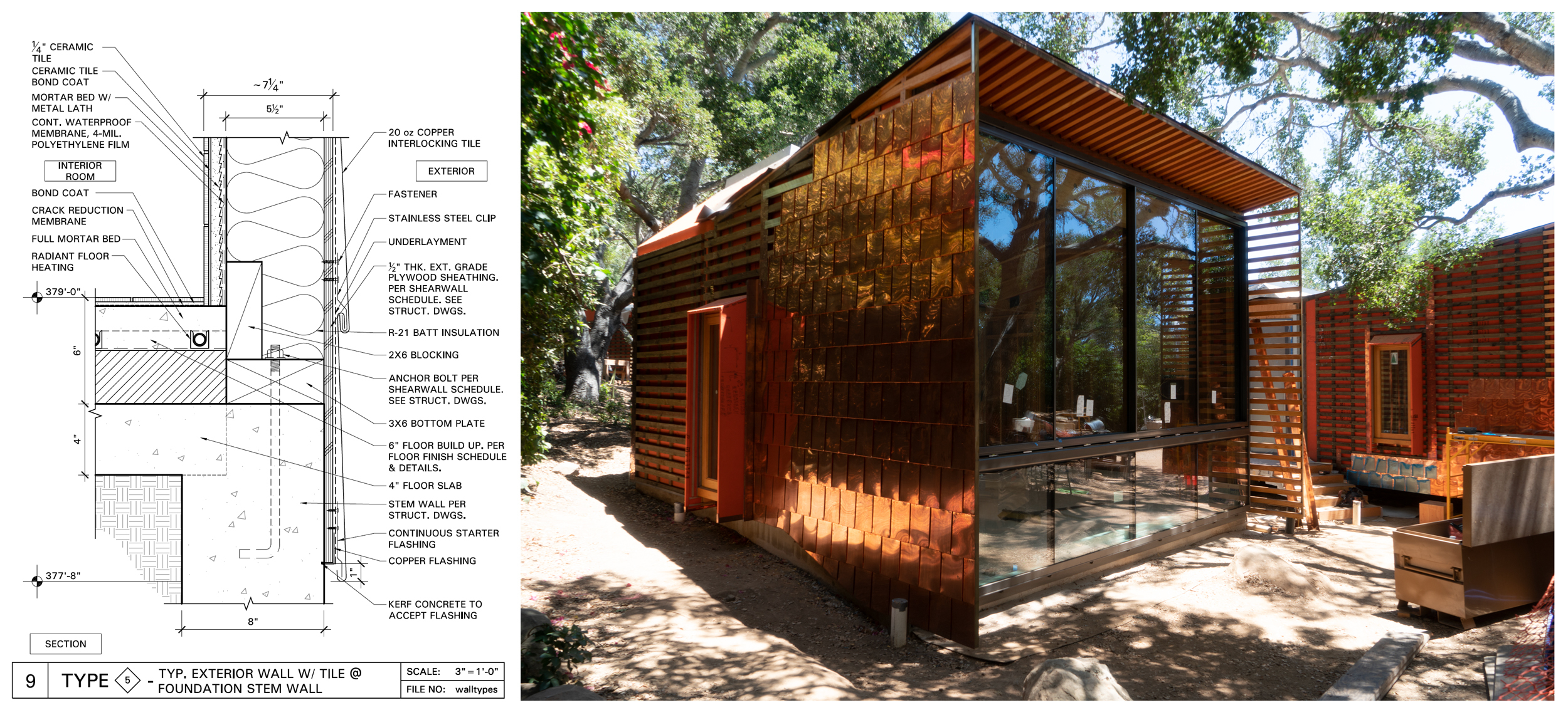
Detail and construction image of the rain screen.
The Branch House is composed of a series of discreet volumes each with its own functional coupling: Kitchen & Breakfast Area, Living Room & Dining Room, Garage & Utility Room, Powder Room & Hall Closet, Master Bedroom & Bathroom, Guest Bedroom & Bathroom, Home Office & Bathroom. The location and orientation of each of these volumes was determined by the location of the existing Oak trees (and their perimeter drip line) and by studying the views from each volume. Each window and skylight frame a particular landscape or piece of sky much the same way that a photographer composes a picture with her camera. Distinct from the mid-century modernists desire to physically and visually blur the boundaries between inside and outside, the Branch House holds the landscape apart from the interior by means of the frame. While the large “picture” windows are primarily designed for viewing out, there are smaller vertical oak wood windows that are designed to provide fresh air and cross ventilation. The sill height and depth of these operable wooden windows also provide window seats.
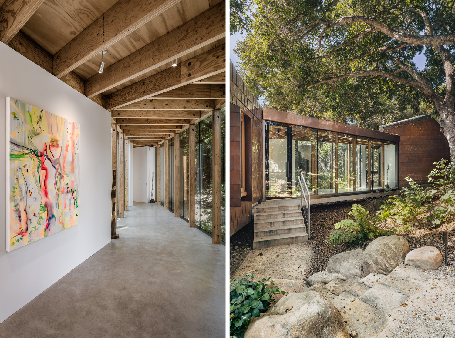
The room volumes of the house are connected by means of a branch-shaped circulation spine that serves as a gallery for the owner’s collection of contemporary art. A continuous concrete slab ties the volumes together at the floor plane, a relationship that is further reinforced by the geometry of the wood ceiling. Floor to ceiling white walls are detailed to float within the gallery. These walls are punctuated by expanses of glass that allow in natural light. Large oak doors, finished with a transparent white stain, allow the living quarters to be closed off from the gallery. This gives privacy to the rooms and allows the gallery to be experienced as an independent aesthetic space separated from the everyday functional living spaces. Located in the gallery/circulation spine are a series of doors that lead to the landscape via cast concrete steps that project outward from the slab. Given its “object in the round” parti, the house gives similar importance to the principal entrance as to the other entrances that lead out to the garden. A small independent structure on the edge of the property serves as the client’s painting studio. The studio, which is also clad in copper, has a single sky lit volume to bring in daylight.
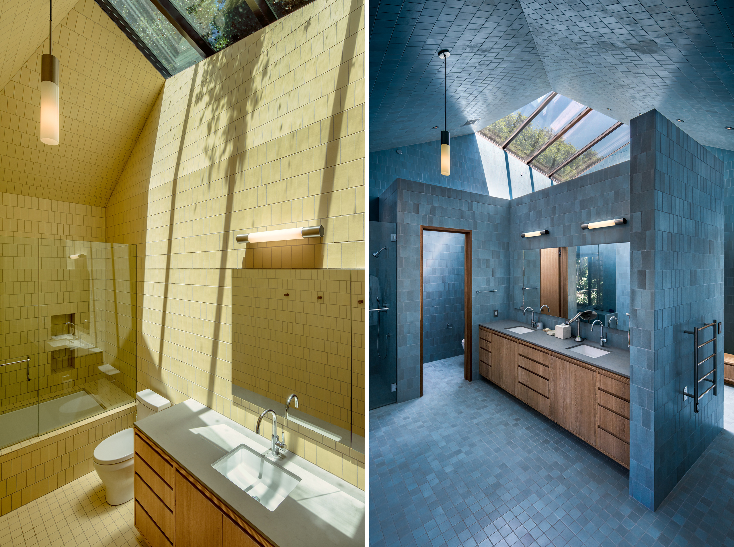
Color and material also play an important role. The copper cladding is developing a patina that over time will further integrate the house into the oak grove landscape. Much of the rest of the material palette was selected for its raw qualities: oak doors, galvanized steel guard rails, Douglas fir ceilings, Oak cabinet doors, and concrete chimneys and flooring. The white walls of the gallery, on the other hand, were selected to accentuate the synthetic qualities of the owners’ contemporary art collection. The “wet” volumes of the house (kitchen, powder room, and bathrooms) are distinguished from the other spaces by floor-to-ceiling, single-color, Heath Ceramic natural clay tile. The richly colored interiors add an element of surprise to the project. The client’s personal interest in color was pivotal in our joint decision to use Heath Ceramics throughout the project. We were drawn to the color of the natural glazes and the slight variations of this hand-made tile. A skylight brings in natural light into each of the colored volumes, making it feel like you are inside of a glazed vessel that is open to the sky.
Tragically right as we were set to begin construction the husband was diagnosed with cancer. The couple considered abandoning the project. The house had been conceived by this lively couple as a refuge for the two of them together. On his deathbed, the husband told his wife that he wanted to go to Montecito. After some months, with this in mind, the wife decided to move ahead with construction. She explained that building the house would be a creative act and that in times like this engaging in a creative act was the right thing to do. We began construction. During this time, the wife, now a widow, told us stories about her life growing up in Montecito and San Francisco, about the generations of Californians in her family, about her and her husband’s life together. The Branch House is a tribute to this relationship.
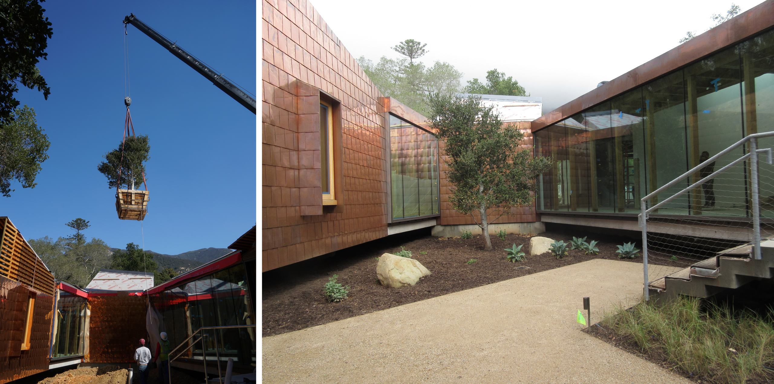
Early on in the design process, Peter suggested that the couple should plant a new oak tree in the exterior court space that would be visible as you entered the house. As construction neared completion Peter and the widow went to nursery to pick out a large Coastal Live Oak for this spot. As we watched the construction crew plant the tree we recognized that this was a fitting way to honor the husband and wife’s marriage, and their desire to make their home in a tree house.
For additional plans and images of the Branch House click here
Size: 5,410 SF
Project Team: Peter Tolkin, Jeremy Schacht, Albert Escobar
Engineers: Joseph Perazzelli (Structural), Michael Viettone Civil Engineering (Civil)
Consultants: Monterey Energy Group, Inc. (Solar/Insulation)
Landscape: Wade Graham Landscape Studio
Lighting Designer: Lighting Design Alliance
Arborist: Westree Inc.
Photographer: David Hartwell
Honor Award, 2020 AIA|LA Residential Architecture Awards, Branch House
2019 Residential Architect Design Awards, "Custom Home More than 3000 square feet", Architect Magazine
 Work
Office